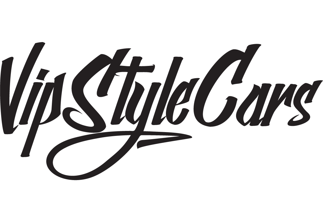
New logo
Looks good. Kinda urban, but good.
C&C: how about a transparent backdrop for it, so that it matches seamlessly?
View original BBCode
Looks good. Kinda urban, but good.
C&C: how about a transparent backdrop for it, so that it matches seamlessly?
Yes that is in the works.
View original BBCode
Yes that is in the works.
Yeah it looks good, though i would change the cars to match the 'style'.
View original BBCode
Yeah it looks good, though i would change the cars to match the 'style'.
Caoboy;113207 wrote:Yeah it looks good, though i would change the cars to match the 'style'.
I think the "CARS" part looks fine. We will fine tune this as we go. Its just I wanted to get rid of the old one asap.
View original BBCode
[quote=Caoboy;113207]Yeah it looks good, though i would change the cars to match the 'style'.[/quote]

I think the "CARS" part looks fine. We will fine tune this as we go. Its just I wanted to get rid of the old one asap.
I think its decent, if the mods dont mind, i'd be willing to put something together and see if it works better???
View original BBCode
I think its decent, if the mods dont mind, i'd be willing to put something together and see if it works better???
I like the sticker version of the logo where the VIP sits on top on the StyleCars part. I will post it up soon. As for any other artwork, send it to [EMAIL="mike@vipstylecars.com"]mike@vipstylecars.com[/EMAIL]
View original BBCode
I like the sticker version of the logo where the VIP sits on top on the StyleCars part. I will post it up soon. As for any other artwork, send it to [EMAIL="mike@vipstylecars.com"]mike@vipstylecars.com[/EMAIL]
Im not feelin it! Maybe it will grow on me but I saw it and was like wtf is that!
I like the old logo better! it wasn't broken so why fix it?
:shrug:
View original BBCode
Im not feelin it! Maybe it will grow on me but I saw it and was like wtf is that!
I like the old logo better! it wasn't broken so why fix it?
:shrug:
Caoboy;113207 wrote:Yeah it looks good, though i would change the cars to match the 'style'.
Yeah, looking at it again, I see what you mean, and agree.
Furthermore, it might help if the ".com" weren't crooked and under the "cars", because that looks kind of haphazardly stacked, which doesn't really convey the meticulousness of building a Vip Style car.
Something to clean up the logo in general is what I'm driving at. Actually, now that I think about it, I liked the old one better lol
Sorry Mike! I guess I shouldn't have started thinking about it?

Not an entry (which is why I didn't send it do you), just an illustration of my thoughts. I hope I got the japanese right. I probably didn't v_v
View original BBCode
[QUOTE=Caoboy;113207]Yeah it looks good, though i would change the cars to match the 'style'.[/QUOTE]

Yeah, looking at it again, I see what you mean, and agree.

Furthermore, it might help if the ".com" weren't crooked and under the "cars", because that looks kind of haphazardly stacked, which doesn't really convey the meticulousness of building a Vip Style car.

Something to clean up the logo in general is what I'm driving at. Actually, now that I think about it, I liked the old one better lol

Sorry Mike! I guess I shouldn't have started thinking about it?

[img]http://img473.imageshack.us/img473/8295/ideamebbein8.png[/img]
Not an entry (which is why I didn't send it do you), just an illustration of my thoughts. I hope I got the japanese right. I probably didn't v_v
It looks cartoon-like and reminds me of Archie and Jughead meets Miami Ink. Not too crazy about that.:shrug:
View original BBCode
It looks cartoon-like and reminds me of Archie and Jughead meets Miami Ink. Not too crazy about that.:shrug:
I hate it !!!! Please go with something else......
View original BBCode
I hate it !!!! Please go with something else......
I dont like it...plus I live in an area....where if I was to drive around with a 5point Star in my windshield, i would get shot.lol
View original BBCode
I dont like it...plus I live in an area....where if I was to drive around with a 5point Star in my windshield, i would get shot.lol
augdogg;113232 wrote:It looks cartoon-like and reminds me of Archie and Jughead meets Miami Ink. Not too crazy about that.:shrug:
Agreed. Dont really like it...using four different fonts??? Keep it clean and simple. I think zion made a nice logo before.
View original BBCode
[quote=augdogg;113232]It looks cartoon-like and reminds me of Archie and Jughead meets Miami Ink. Not too crazy about that.:shrug:[/quote]Agreed. Dont really like it...using four different fonts??? Keep it clean and simple. I think zion made a nice logo before.
firelizard;113225 wrote:Yeah, looking at it again, I see what you mean, and agree.
Furthermore, it might help if the ".com" weren't crooked and under the "cars", because that looks kind of haphazardly stacked, which doesn't really convey the meticulousness of building a Vip Style car.
Something to clean up the logo in general is what I'm driving at. Actually, now that I think about it, I liked the old one better lol
Sorry Mike! I guess I shouldn't have started thinking about it?
Not an entry (which is why I didn't send it do you), just an illustration of my thoughts. I hope I got the japanese right. I probably didn't v_v
I like this one
View original BBCode
[quote=firelizard;113225]Yeah, looking at it again, I see what you mean, and agree.

Furthermore, it might help if the ".com" weren't crooked and under the "cars", because that looks kind of haphazardly stacked, which doesn't really convey the meticulousness of building a Vip Style car.

Something to clean up the logo in general is what I'm driving at. Actually, now that I think about it, I liked the old one better lol

Sorry Mike! I guess I shouldn't have started thinking about it?

[IMG]http://img473.imageshack.us/img473/8295/ideamebbein8.png[/IMG]
Not an entry (which is why I didn't send it do you), just an illustration of my thoughts. I hope I got the japanese right. I probably didn't v_v[/quote]

I like this one
Its kinda busy with all the different fonts and sizes and I think it needs some color like the gold to accent it more...
View original BBCode
Its kinda busy with all the different fonts and sizes and I think it needs some color like the gold to accent it more...
I really like the new logo, Im with the others though "cars" text should match "style". It would flow better.
View original BBCode
I really like the new logo, Im with the others though "cars" text should match "style". It would flow better.
Sorry but I am not feeling that new logo..The crown is cool but the rest eehhh just not diggin it..does not represent VIP that well...more like something you would see on a hotwheels packaging..
here is something I was working on...


I think it reps the VIP scene real well...Luxury and Bling Bling..
View original BBCode
Sorry but I am not feeling that new logo..The crown is cool but the rest eehhh just not diggin it..does not represent VIP that well...more like something you would see on a hotwheels packaging..
here is something I was working on...

[IMG]http://i83.photobucket.com/albums/j298/q45t07/vipstylecars.jpg[/IMG]
[IMG]http://i83.photobucket.com/albums/j298/q45t07/vipstylecars2.jpg[/IMG]

I think it reps the VIP scene real well...Luxury and Bling Bling..
I like firelizards, but the Japanese is wrong. "E I Ga Na Ri", not even sure what you were trying to type lol. I like the fonts Rich used, but I'm not into diamond bling.
View original BBCode
I like firelizards, but the Japanese is wrong. "E I Ga Na Ri", not even sure what you were trying to type lol. I like the fonts Rich used, but I'm not into diamond bling.
DO IT!!!
RaCinStylez;113283 wrote:I like this one
+2 :biggthumpup:
View original BBCode
[quote=RaCinStylez;113283]I like this one[/quote]

+2 :biggthumpup:
F.L.S.;113318 wrote:I like firelizards, but the Japanese is wrong. "E I Ga Na Ri", not even sure what you were trying to type lol. I like the fonts Rich used, but I'm not into diamond bling.
lol, I figured something would have been lost in translation.
http://jisho.org/words?jap=&eng=luxury&dict=edict
http://jisho.org/words?jap=&eng=style&dict=edict
Was my source:pat:
View original BBCode
[QUOTE=F.L.S.;113318]I like firelizards, but the Japanese is wrong.   "E I Ga Na Ri", not even sure what you were trying to type lol.  I like the fonts Rich used, but I'm not into diamond bling.[/QUOTE]

lol, I figured something would have been lost in translation.

[url]http://jisho.org/words?jap=&eng=luxury&dict=edict[/url]
[url]http://jisho.org/words?jap=&eng=style&dict=edict[/url]

Was my source:pat:
i personally think it looks like something you see on those source magazines which features rappers with dub cars in the background

just doesnt seem to hae that prestige feeling VIP is all about

i think something simple makes it stand out better
View original BBCode
i personally think it looks like something you see on those source magazines which features rappers with dub cars in the background
just doesnt seem to hae that prestige feeling VIP is all about
i think something simple makes it stand out better
Firelizard, it doesnt really make sense. You can say 高級車仕様 which means "luxury car style" but why not just have the katakana for the name ビップスタイルカー
View original BBCode
Firelizard, it doesnt really make sense. You can say 高級車仕様 which means "luxury car style" but why not just have the katakana for the name ビップスタイルカー
Looks like he was trying to say "become luxurous" but the grammar doesn't seem to work well.
View original BBCode
Looks like he was trying to say "become luxurous" but the grammar doesn't seem to work well.
I would use Katakana like Dom suggested and then it's basically an English word, but in Japanese characters.
View original BBCode
I would use Katakana like Dom suggested and then it's basically an English word, but in Japanese characters.
Thanks guys! That is what I was going for ;)
I can't read/write/speak japanese
View original BBCode
Thanks guys! That is what I was going for ;)
I can't read/write/speak japanese
WRONG IMAGE FOR US....


looks like a LA gang font.


we need CLASSS!!!!!!!!!!!!!!!!!!!!!!!!!!!!!!!!!!!!!!
View original BBCode
WRONG IMAGE FOR US....
looks like a LA gang font.
we need CLASSS!!!!!!!!!!!!!!!!!!!!!!!!!!!!!!!!!!!!!!
Simple elegance...just my opinion. Until then use something simple like this:

View original BBCode
Simple elegance...just my opinion.  Until then use something simple like this:
[IMG]http://www.vipemporium.com/vsc/vsctemplogo.gif[/IMG]
or maybe try adding some crystals on the word "VIP"... give it more of a luxury feel.
View original BBCode
or maybe try adding some crystals on the word "VIP"... give it more of a luxury feel.
Here is the sticker version. I will upload this one instead once I changed the background. And there will be no crystals in the logo.
View original BBCode
Here is the sticker version. I will upload this one instead once I changed the background. And there will be no crystals in the logo.
HotBox009;113507 wrote:or maybe try adding some crystals on the word "VIP"... give it more of a luxury feel.
:hsughwerdv7: ......but there are lots of folks that dont feel the bling bling.

View original BBCode
[quote=HotBox009;113507]or maybe try adding some crystals on the word "VIP"... give it more of a luxury feel.[/quote]
:hsughwerdv7: ......but there are lots of folks that dont feel the bling bling.[IMG]http://i83.photobucket.com/albums/j298/q45t07/hsughwerdv72367.gif[/IMG]
mdenoga;113518 wrote:Here is the sticker version. I will upload this one instead once I changed the background. And there will be no crystals in the logo.
still not feelin the sticker version...loooks to cartoonie..gato made a great point about it looking like LA gang font...I could see that tatood on some homeboy...LOL
View original BBCode
[QUOTE=mdenoga;113518]Here is the sticker version. I will upload this one instead once I changed the background. And there will be no crystals in the logo.[/QUOTE]
still not feelin the sticker version...loooks to cartoonie..gato made a great point about it looking like LA gang font...I could see that tatood on some homeboy...LOL
Looks like Mike made up his mind already.

Oh well. Kinda too bad, doesn't seem like many people like it much either.
View original BBCode
Looks like Mike made up his mind already.
Oh well. Kinda too bad, doesn't seem like many people like it much either.
Some people will like it and some won't. But as of now, its final and remember its temporary for the site. Though I am open to feedback/comments. Anymore comments send them to [EMAIL="mike@vipstylecars.com"]mike@vipstylecars.com[/EMAIL] Logo is fine. Crown matches the icons on the main index and the two different font styles balance each other.
View original BBCode
Some people will like it and some won't. But as of now, its final and remember its temporary for the site. Though I am open to feedback/comments. Anymore comments send them to [EMAIL="mike@vipstylecars.com"]mike@vipstylecars.com[/EMAIL] Logo is fine. Crown matches the icons on the main index and the two different font styles balance each other.